Button
Usage
We have standardized buttons documented on Primer CSS and Primer Components, and these docs which serve as the source of truth for development implementation. This article serves to supplement our technical docs with proper guidance on design implementation.
Types
At GitHub, buttons are a fundamental building block of our products. Most of the time, we use the "Default" button type, but other types of buttons may be used to indicate something special about the button's hierarchy or functionality. The following table catalogues a quick glance at how we use buttons at GitHub:
| Type | Visual | Usage |
|---|---|---|
| Default |  | The go-to style to render a button |
| Outline |  | To downplay a button, for navigation buttons, or for filter buttons |
| Primary |  | To emphasize the highest priority action on a view |
| Danger |  | To warn that an action is potentially dangerous or destructive |
| Invisible |  | A subtle style used for actions that are of lower priority in a view's button hierarchy |
Text
Labels
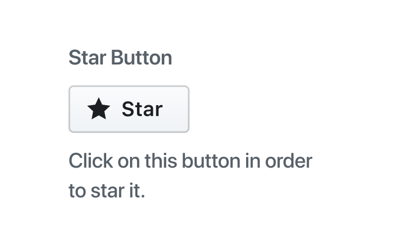
When designing buttons, keep the label as concise as possible. Buttons are to be understood by their type and text. If further clarity is required, consider adding an Octicon or adding a caption.
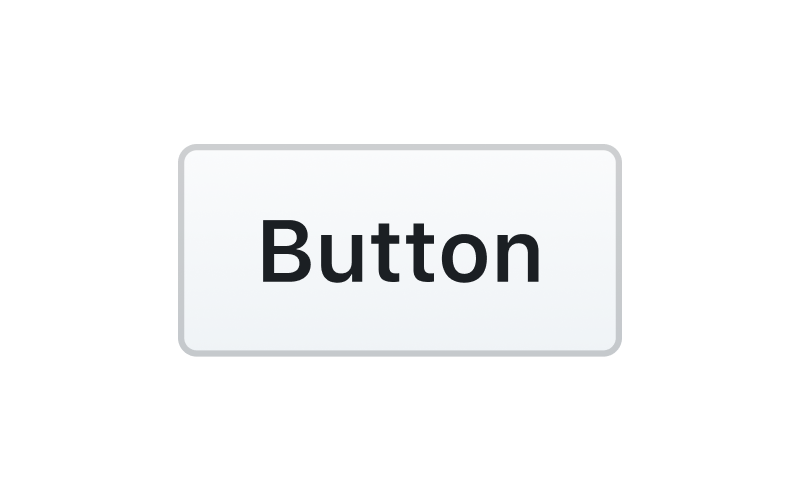
Use sentence case
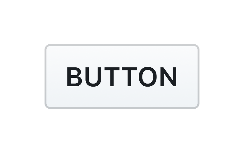
Don't use all-caps or other text formats
Captions
In certain scenarios, buttons require supporting text to give the user more context. Use text labels sparingly, as buttons should generally be able to be understood on their own.
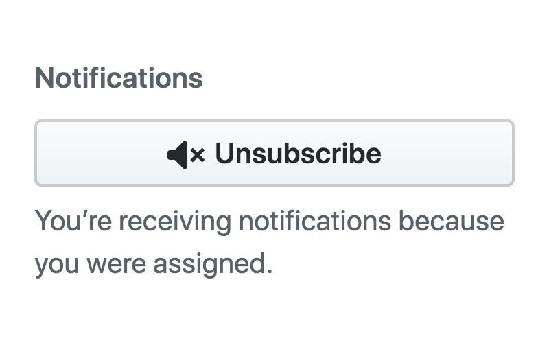
Keep text brief, specific, and descriptive
Don't use unnecessary, redundant text descriptions
Sizes
| Size | Usage |
|---|---|
| Medium | The default button size |
| Small | Decrease button size when space is limited and the action is of lesser significance. |
| Large | Increase button size to bring prominence to buttons that have major impact. Use large buttons sparingly, as layouts should generally have only one large button. |
React
AlphaPlayground
Props
Property Name Type Default Description
| Name | Type | Values | Default |
|---|---|---|---|
| isboolean? | boolean | true, false | false |
| isboolean? | boolean | true, false | false |
| isboolean? | boolean | true, false | false |
| isboolean? | boolean | true, false | false |
| isboolean? | boolean | true, false | false |
Examples
Rails
BetaPlayground
Props
Property Name Type Default Description
| Name | Type | Values | Default |
|---|---|---|---|
| isboolean? | boolean | true, false | false |
| isboolean? | boolean | true, false | false |
| isboolean? | boolean | true, false | false |
| isboolean? | boolean | true, false | false |
| isboolean? | boolean | true, false | false |
Examples
Figma
Avatars are images that users can set as their profile picture. On GitHub, they're always going to be rounded squares. They can be custom photos, uploaded by users, or generated as Identicons as a placeholder. Use to visually identify a human (circle), or other entity (square) such as an organization, bot, or team.
Playground
Props
Property Name Type Default Description
| Name | Type | Values | Default |
|---|---|---|---|
| isboolean? | boolean | true, false | false |
| isboolean? | boolean | true, false | false |
| isboolean? | boolean | true, false | false |
| isboolean? | boolean | true, false | false |
| isboolean? | boolean | true, false | false |
Examples
Accessibility
Usage
We can place an icon inside the Button in either the leading or the trailing position to enhance the visual context. It is recommended to use an octicon here. We can place an icon inside the Button in either the leading or the trailing position to enhance the visual context. It is recommended to use an octicon here. We can place an icon inside the Button in either the leading or the trailing position to enhance the visual context. It is recommended to use an octicon here. We can place an icon inside the Button in either the leading or the trailing position to enhance the visual context. It is recommended to use an octicon here. We can place an icon inside the Button in either the leading or the trailing position to enhance the visual context. It is recommended to use an octicon here. We can place an icon inside the Button in either the leading or the trailing position to enhance the visual context. It is recommended to use an octicon here. We can place an icon inside the Button in either the leading or the trailing position to enhance the visual context. It is recommended to use an octicon here. We can place an icon inside the Button in either the leading or the trailing position to enhance the visual context. It is
Examples
We can place an icon inside the Button in either the leading or the trailing position to enhance the visual context. It is recommended to use an octicon here. We can place an icon inside the Button in either the leading or the trailing position to enhance the visual context. It is recommended to use an octicon here. We can place an icon inside the Button in either the leading or the trailing position to enhance the visual context. It is recommended to use an octicon here. We can place an icon inside the Button in either the leading or the trailing position to enhance the visual context. It is recommended to use an octicon here. We can place an icon inside the Button in either the leading or the trailing position to enhance the visual context. It is recommended to use an octicon here. We can place an icon inside the Button in either the leading or the trailing position to enhance the visual context. It is recommended to use an octicon here. We can place an icon inside the Button in either the leading or the trailing position to enhance the visual context. It is recommended to use an octicon here. We can place an icon inside the Button in either the leading or the trailing position to enhance the visual context.